Deep Navy#071B32
Accent color and dark-theme surfaces
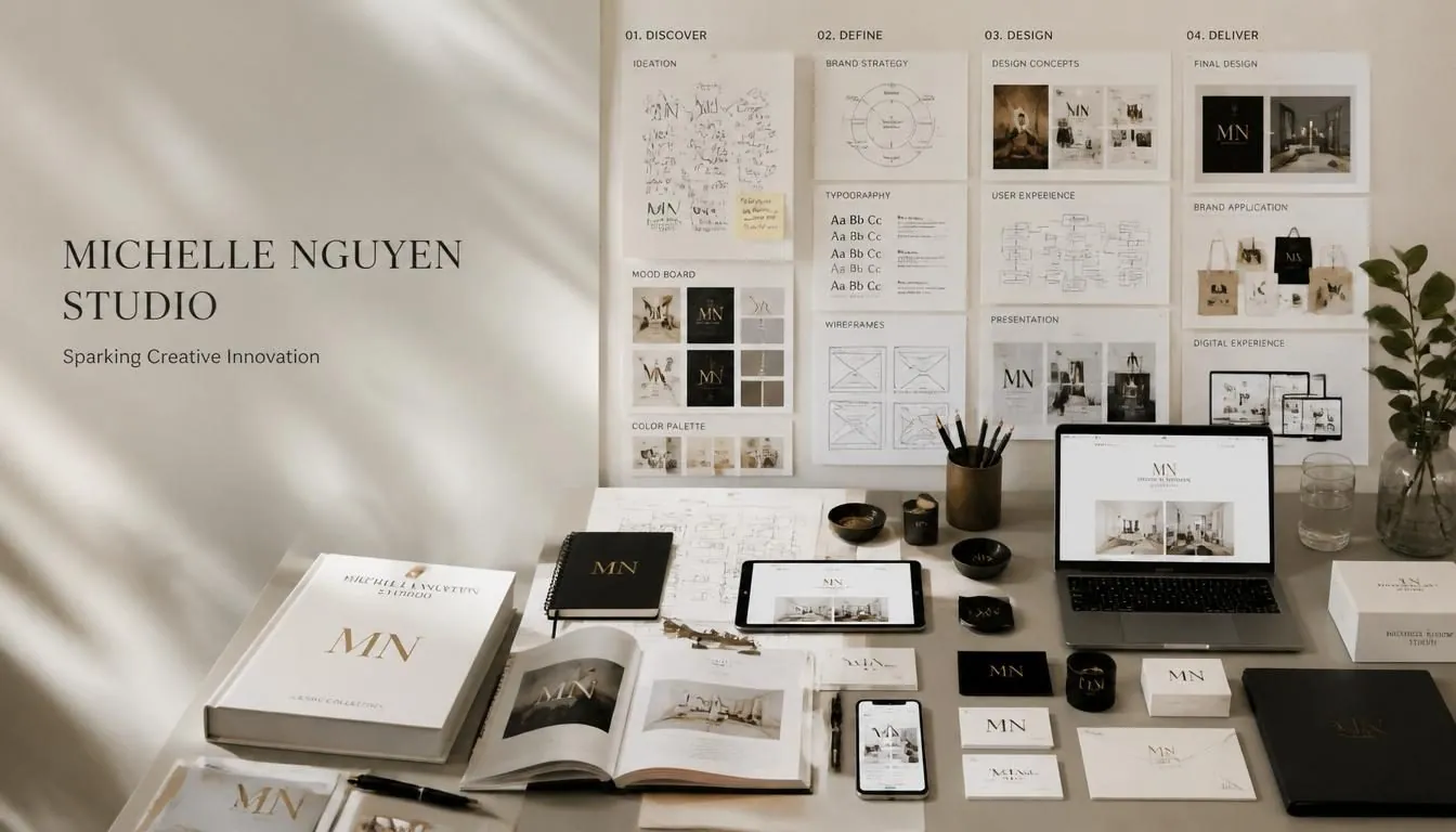
The design system behind Michelle Nguyen Studio — built the same way I'd build yours.

The palette is built around warm editorial neutrals, precise contrast, and controlled accents. White and ivory create space; black and graphite establish hierarchy; Deep Navy supports accents and dark themes; red and champagne carry the studio signature.
Accent color and dark-theme surfaces
Primary ink and dark grounds
Secondary text and supporting information
Logo color, fine rules, and premium highlights
Primary accent, calls to action, and emphasis
Primary ground and maximum clarity
Alternate ground and editorial warmth
Borders, dividers, and quiet structure
Use Studio Red for actions and priority messages. Champagne belongs in the logo, fine rules, icons, and premium details.
Pure White is the primary canvas. Soft Ivory creates gentle section changes without making the interface feel boxed in.
Use Midnight Black for primary text and Graphite for supporting copy. Architectural Gray is structural, never a substitute for readable text.
These practical rules keep the identity recognizable across websites, presentations, reports, campaigns, social media, and print production.
Preserve generous clear space and use only approved lockups. Never stretch, outline, recolor, rotate, or add effects to the logo.
Cormorant leads editorial display, Inter carries reading text, IBM Plex Mono organizes data, and Allura is reserved for the slogan or signature.
Choose simple outline icons with consistent 1.5–2px strokes, rounded terminals, clear geometry, and no mixed filled-icon styles.
Favor natural light, architectural space, premium paper, human detail, and restrained warmth. Avoid busy stock scenes and heavy filters.
The identity moves from digital guidelines into tactile editorial pieces without losing its calm, premium character.
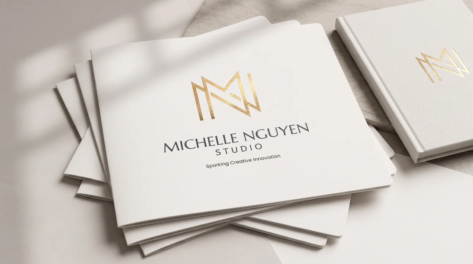
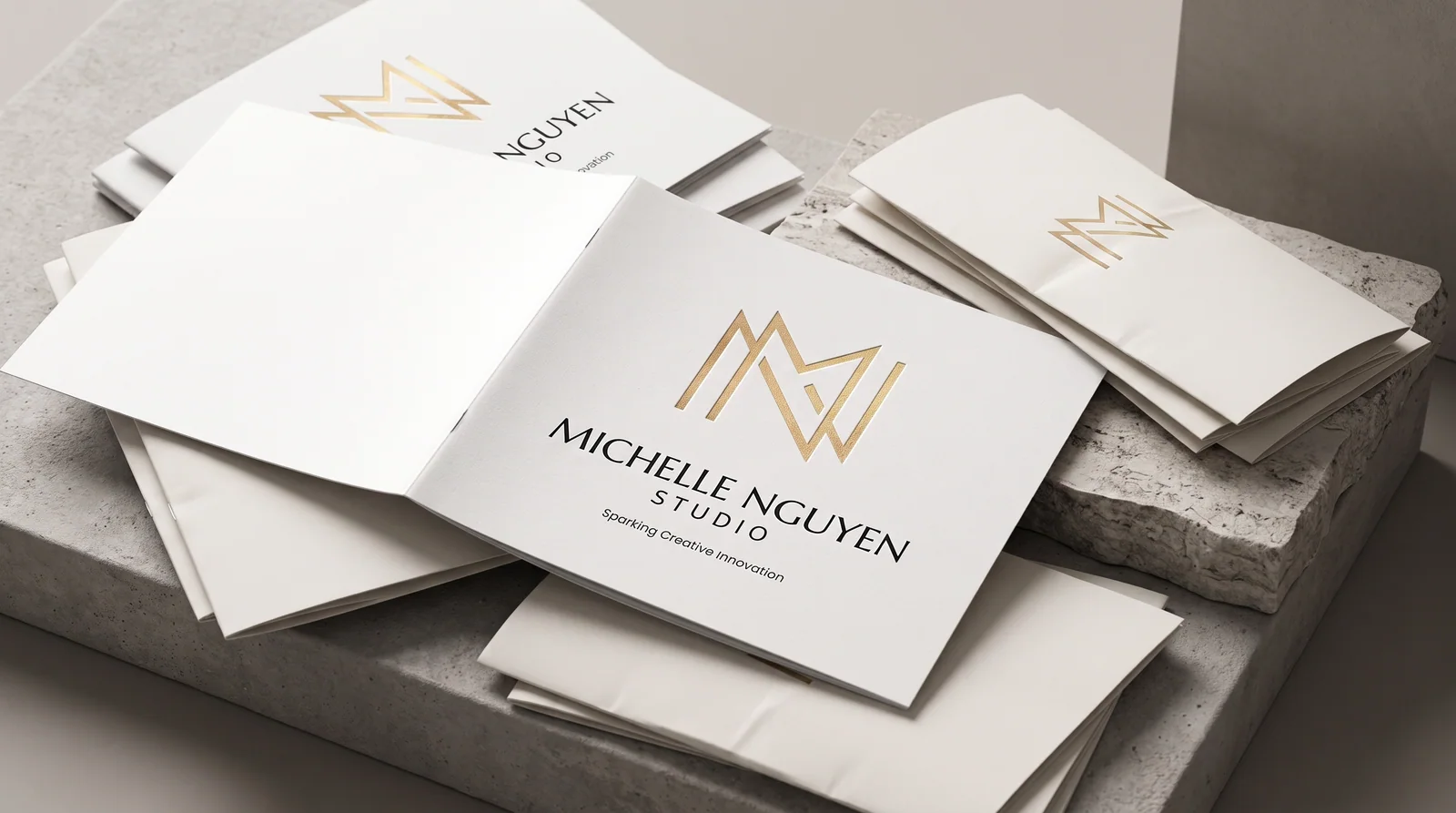
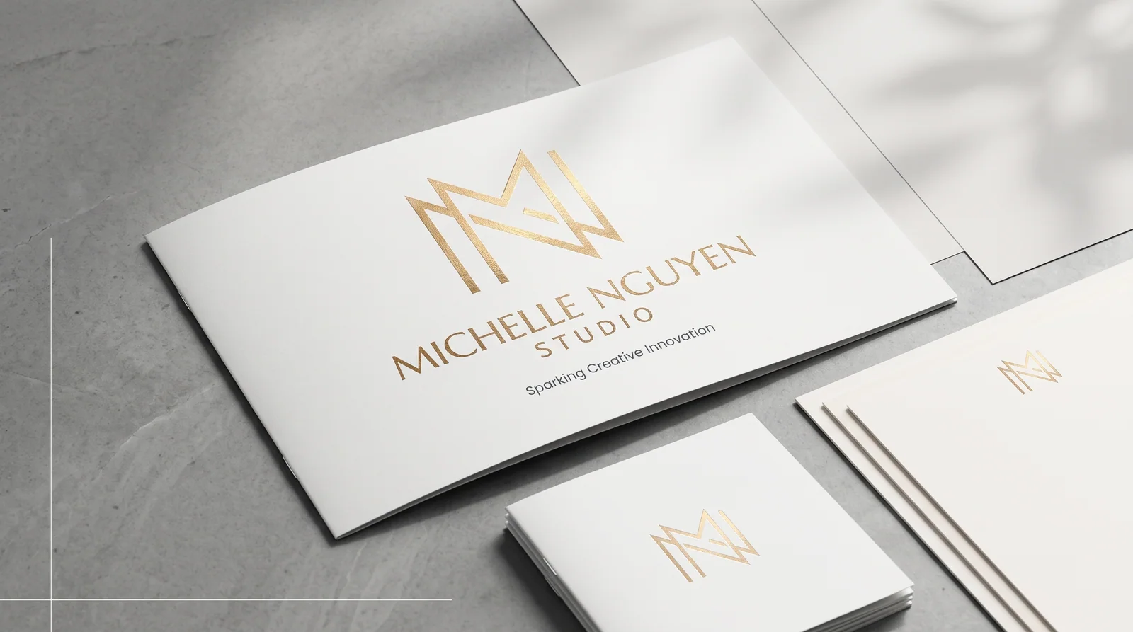
A strong identity is more than a collection of attractive assets. Every decision is connected, documented, and prepared to work consistently across print, web, presentations, and campaigns.
Audience, goals, and context
Positioning, voice, and direction
Logo, color, type, and language
Rules, templates, and accessibility
Production-ready files and handoff
The same visual logic follows every customer and stakeholder touchpoint.
Contrast, legibility, and inclusive use are built into the system from the start.
The identity stays useful as teams, platforms, audiences, and needs grow.
Baked into every brand identity engagement — no template shortcuts, no add-ons for the things a real brand system already needs.