Environmental
Trade-Show Booth
National conference
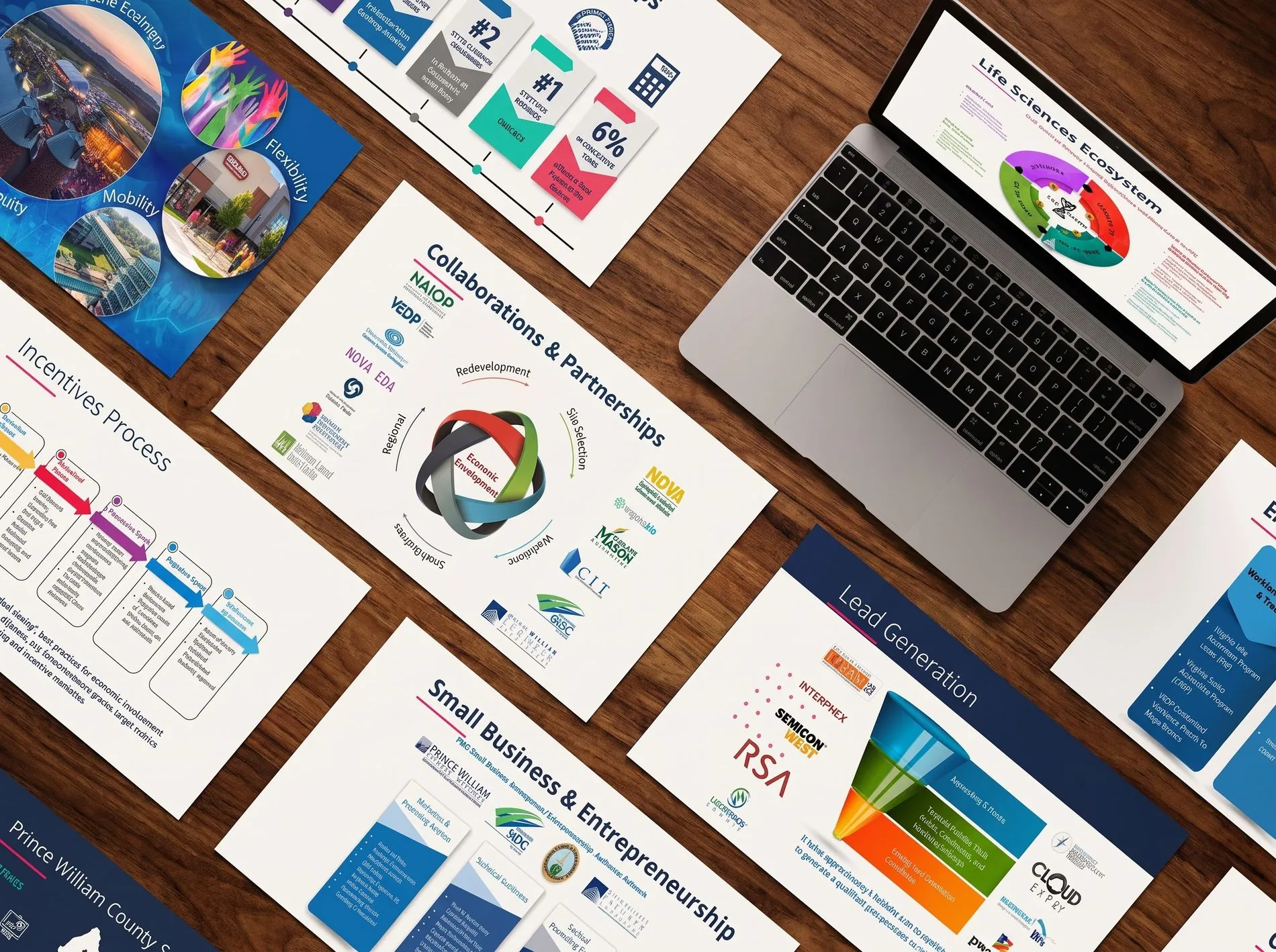
Prince William County — one brand, consistent from screen to trade-show floor
A brand is only as convincing as its least convincing touchpoint — and for a county competing for national investment, that touchpoint was frequently something you could pick up, walk past, or stand inside.
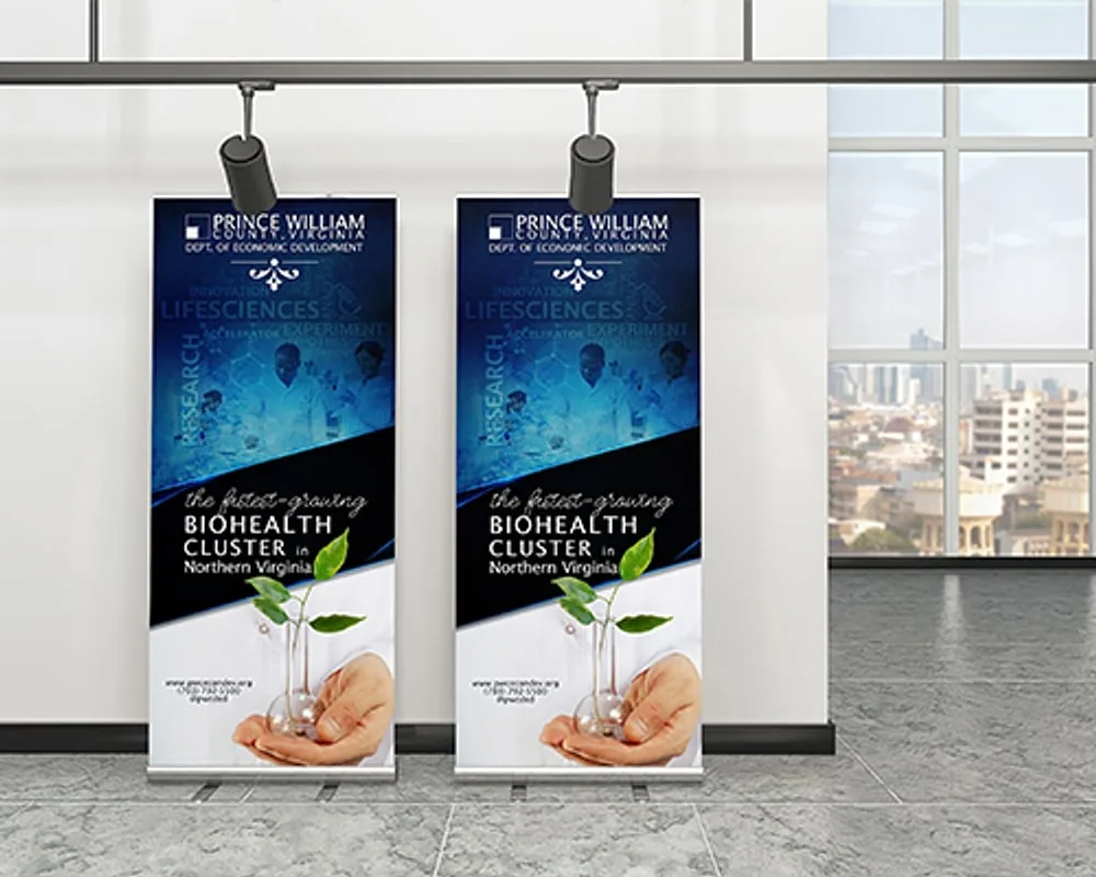
Prince William County's identity worked on screen. The harder test was a national trade-show floor, where the county stood alongside regions with considerably larger marketing budgets and had a few seconds to stop someone walking past.
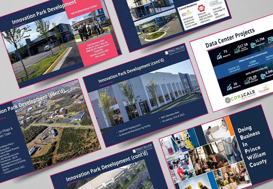
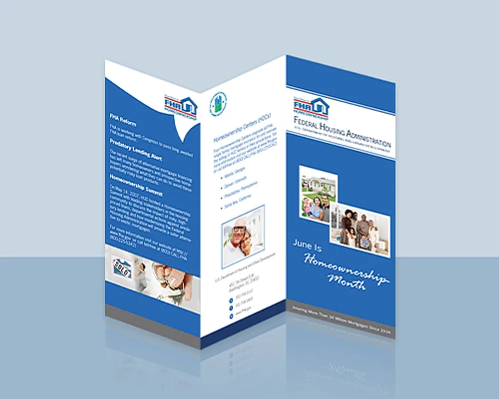
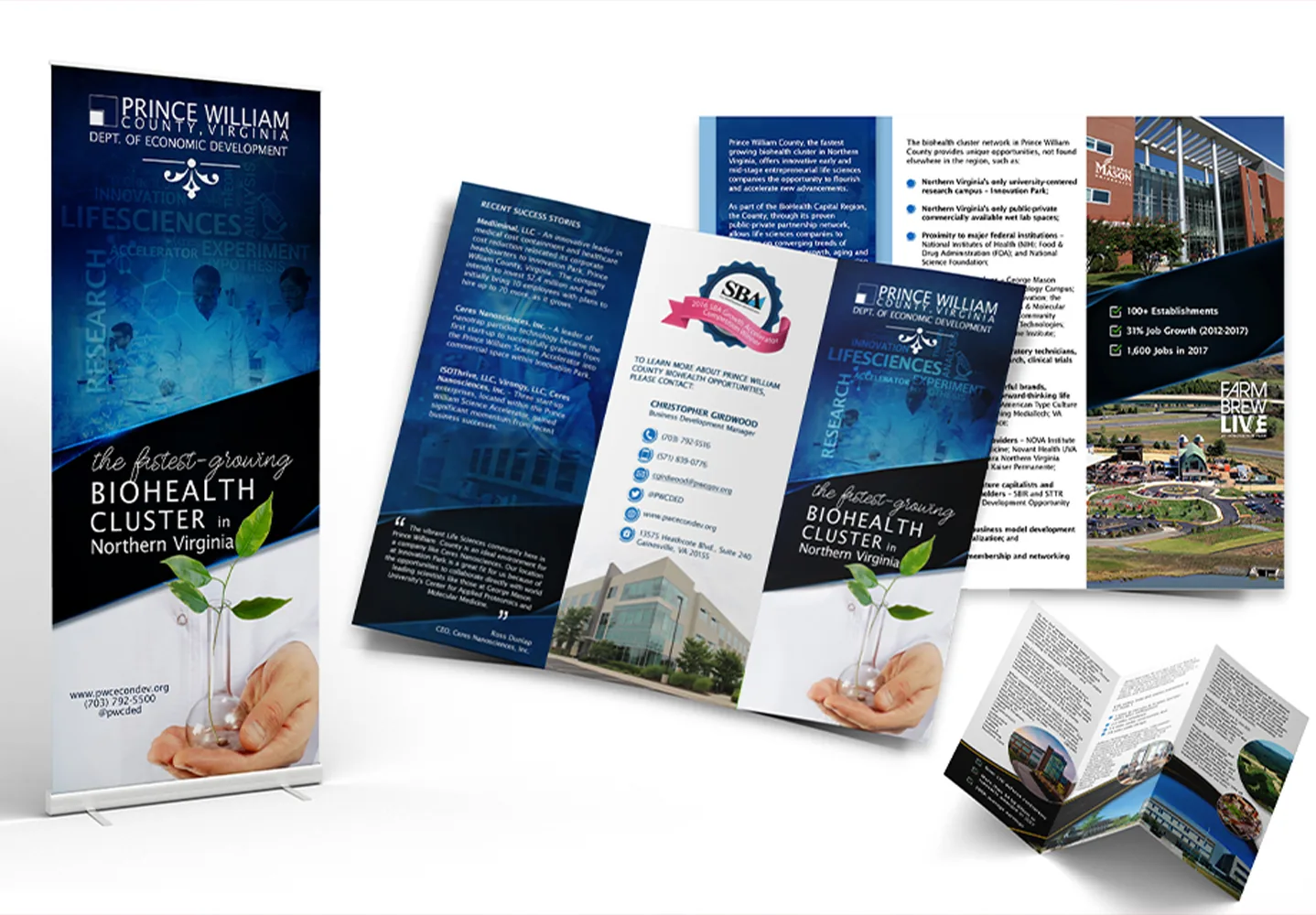
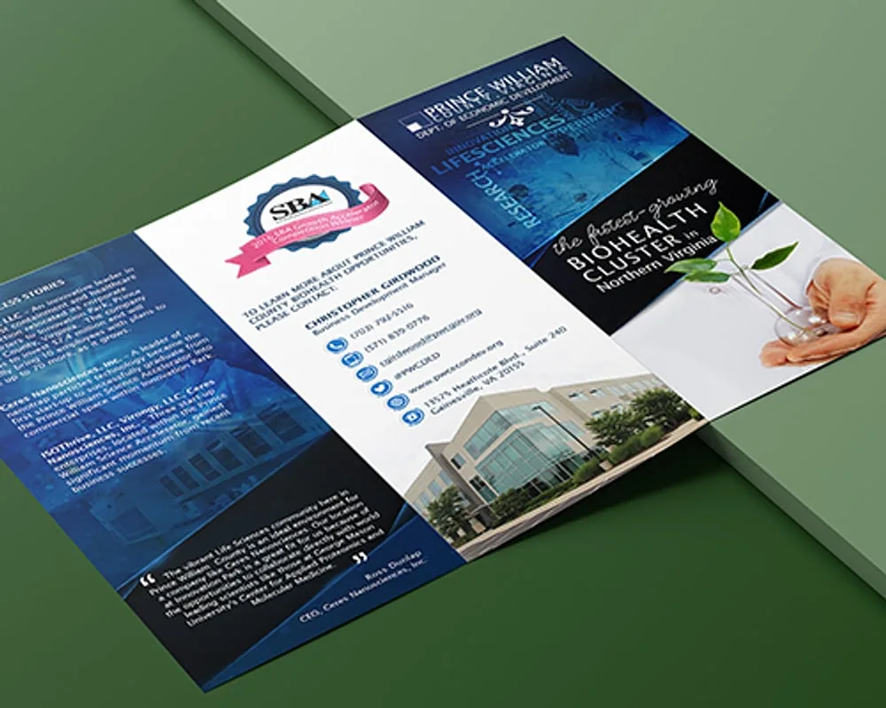
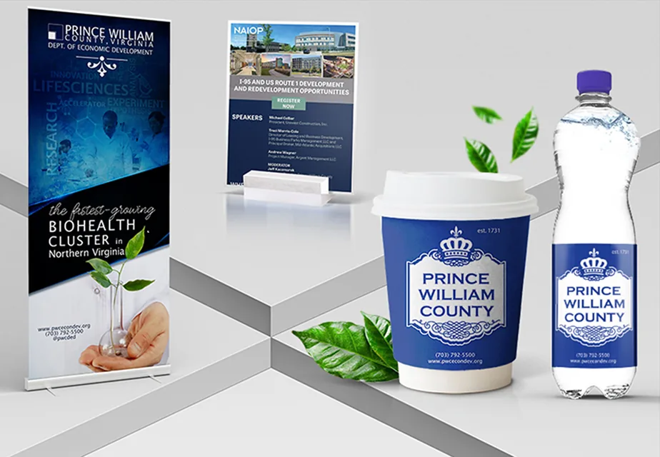
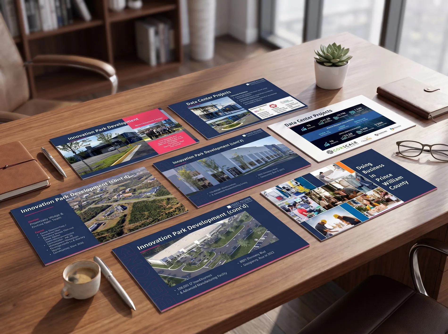
The same identity had to hold across dozens of physical formats — booth environments, trifold brochures, sector one-sheets, corporate literature, campaign flyers, custom product labels and event giveaways — each with its own size, substrate, viewing distance and production constraints. A system that only works on a screen is not a system.
Rather than designing each item on its own terms, I built a format matrix: every deliverable mapped against how far away it would be read from, how long the reader would give it, and what it would be printed on.
That matrix set the rules. Booth graphics were designed for legibility at ten feet and a three-second walk-by. Brochures were designed for someone already holding them. Labels were designed for a surface that curves. The identity stayed constant; the execution flexed to the physics of each object.
Brand audit first, then the format matrix, then design, then production specification — bleeds, substrates, finishes, color profiles — and finally press checks and on-site setup at the events themselves.
Working the events in person mattered more than it sounds. Seeing which panels people actually stopped at, and which they walked past, fed directly into the next round of booth design.
Every piece had a specified read distance, and type and hierarchy were set to that distance rather than to how it looked zoomed in.
Because a booth is read from ten feet awayOne headline, one image, one action — anything else on a booth panel competes with the person standing in front of it.
Because a walk-by is not a reading sessionSubstrate, coating and finish chosen alongside the layout, not delegated to the printer afterwards.
Because paper stock communicates before the copy doesProduction-ready files and specifications so the department could reprint and extend without starting over.
Because a system nobody can use is just a folderThe county went to national conferences with a booth environment and a complete collateral suite that read as one coherent, well-resourced brand — supporting the same coordinated effort that lifted brand visibility 15% and engagement 25%.
The production specifications and templates stayed with the department, so later material could be produced without redesigning the system each time.
Digital work is easy to revise and easy to forget. A booth panel is printed once, stands eight feet tall, and either stops someone or doesn't. Designing for that — where the mistake is permanent and public — is the fastest way I know to learn what actually communicates.
The first conversation is free and takes twenty minutes. If it isn't a fit, I'll tell you.