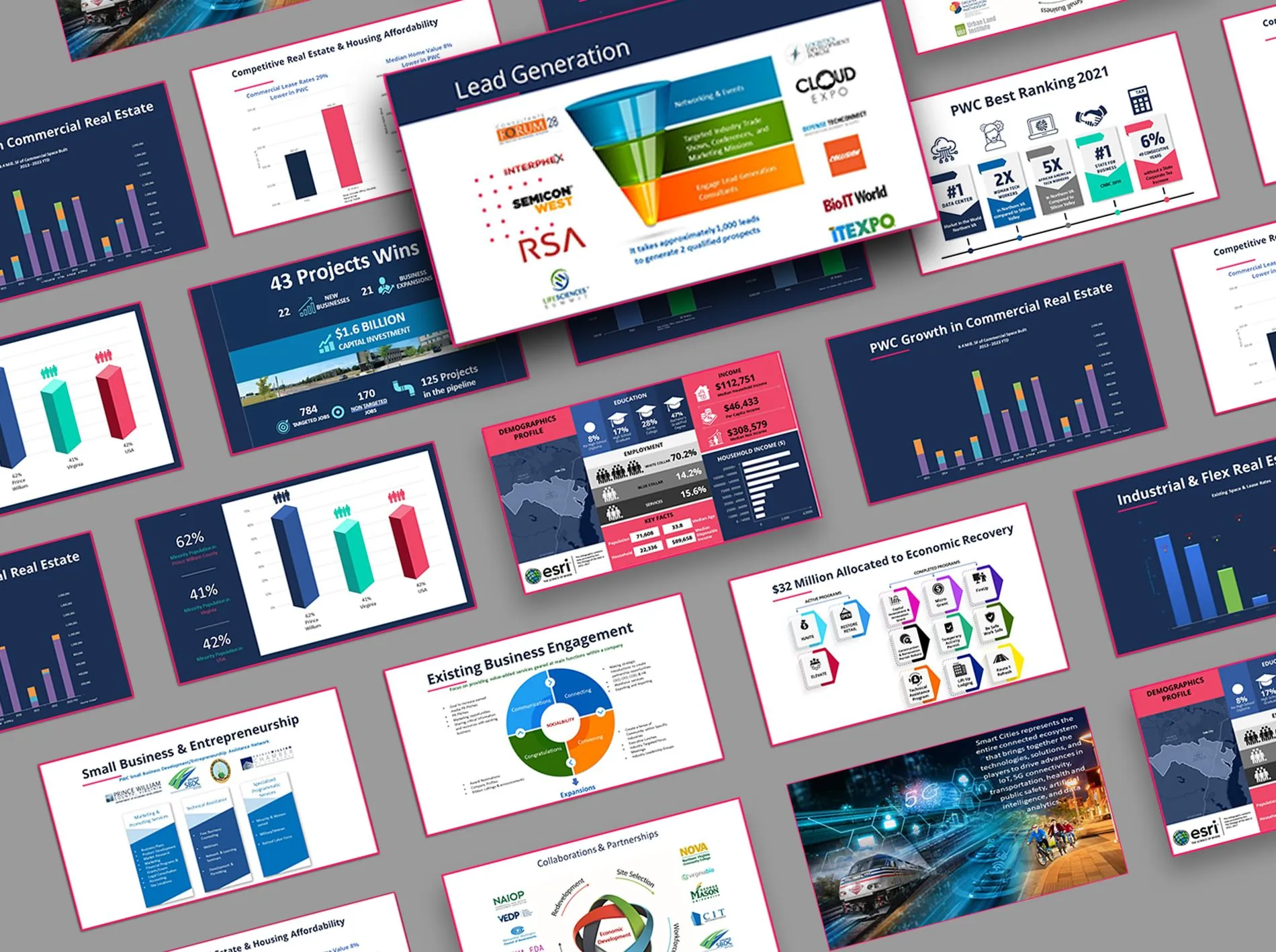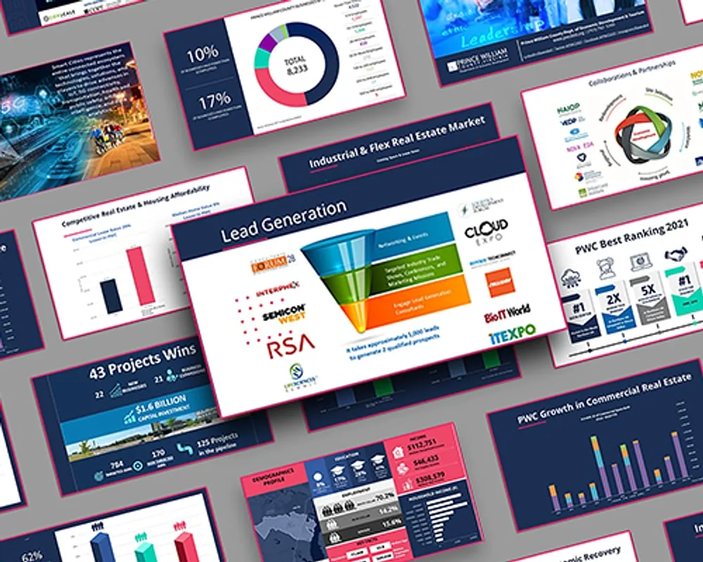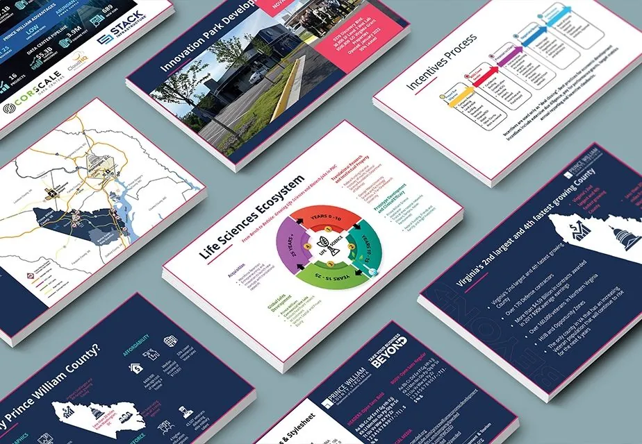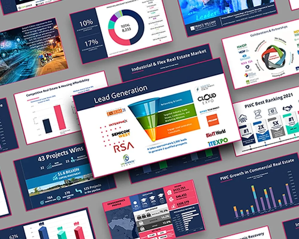
Infographics
Economic Snapshot
Prince William County
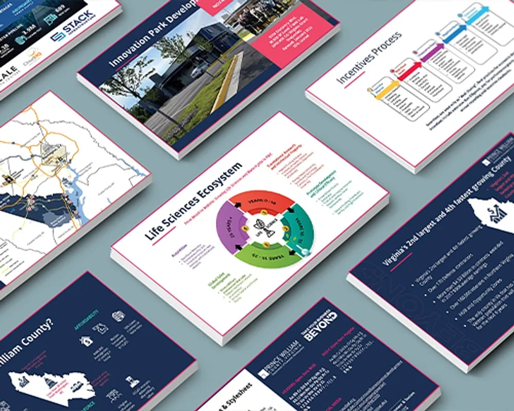
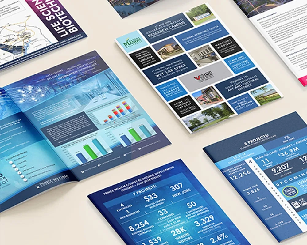
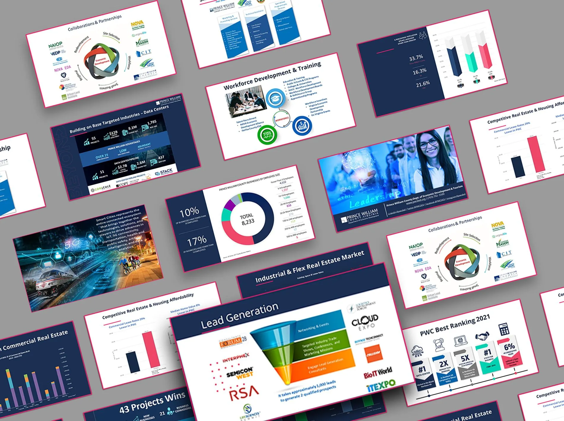
Prince William County — turning economic data into memorable, shareable visuals: newsletters, lead-gen emails, monthly reports, and director-facing presentations
A county with more data than almost anyone knew what to do with — employment, development, demographics, growth — and a business audience that would give it about eight seconds before deciding whether to keep reading.
Prince William County's Department of Economic Development had genuinely good numbers. Employment figures, sector growth, development pipelines, demographic shifts — the raw material for a persuasive case to any business considering the county.
But it arrived as spreadsheets and dense reports, and it had to travel through a lot of different channels — monthly newsletters, lead-generation emails, quarterly reports, presentations and speeches, talking points, and event materials built for directors. A county leader could not act on it at a glance, and a site-selection executive comparing three regions was never going to read it at all. The information existed; the understanding didn't.
The temptation with a rich dataset is to show all of it. I went the other way: every graphic makes exactly one point, and anything not serving that point comes out.
That discipline turned into a system rather than a set of one-off graphics — a consistent chart language, a fixed palette, and repeatable layouts so that reports, proposals and mailers all read as the same county speaking with the same voice, quarter after quarter.
Each piece started by working out what the numbers actually said — which meant real conversations with the analysts who produced them, not just receiving a spreadsheet. Only then: hierarchy, layout, visual system, accessibility check, and production for both print and screen.
The same system carried into investor proposals, trade-show material, campaign design and the county's digital properties, so the visual language held wherever the audience met it.
Each visual answers a single question. Related points get their own graphic rather than a second axis.
Because a chart that needs explaining has already failedThe same colors, weights and shapes mean the same thing in a quarterly report as in an investor deck.
Because recognition is faster than readingPalettes validated for legibility rather than chosen for looks — including in print.
Because public information has to reach the whole publicLayouts that hold at tabloid size on a booth wall and on a phone in a meeting.
Because the same figure gets used in both, alwaysThe coordinated marketing effort lifted brand visibility by 15% and engagement by 25%. The infographic system became the standard format for economic development reporting across the department.
Every public-facing deliverable met WCAG contrast and legibility standards — which for a government publication is not optional.
Public bodies publish an enormous amount of information that nobody reads, and it is almost never because the information was uninteresting. Making a county's own data legible to its own residents and investors is a small piece of civic infrastructure — and it is the most transferable skill I have.
The first conversation is free and takes twenty minutes. If it isn't a fit, I'll tell you.