Web UI/UX
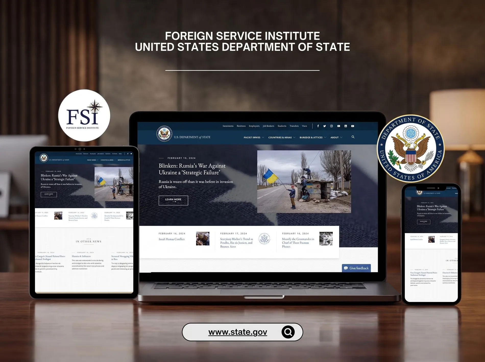
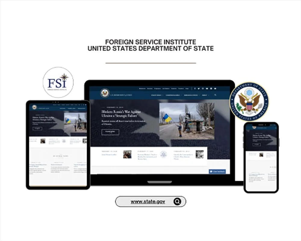
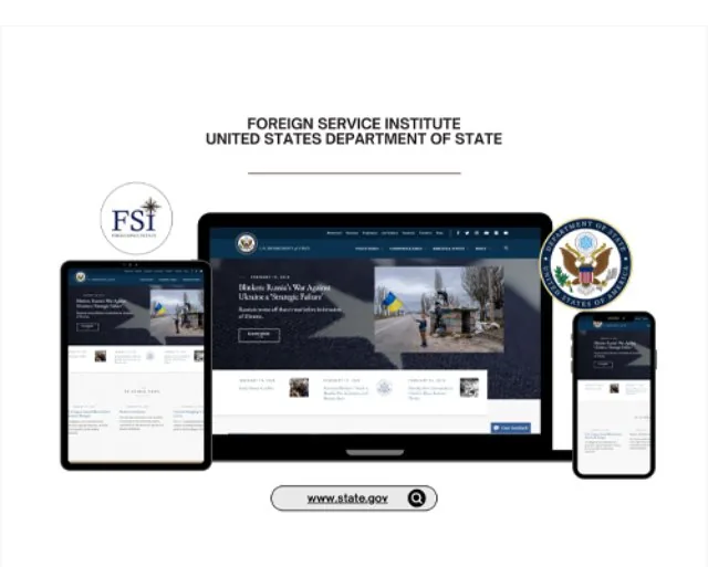
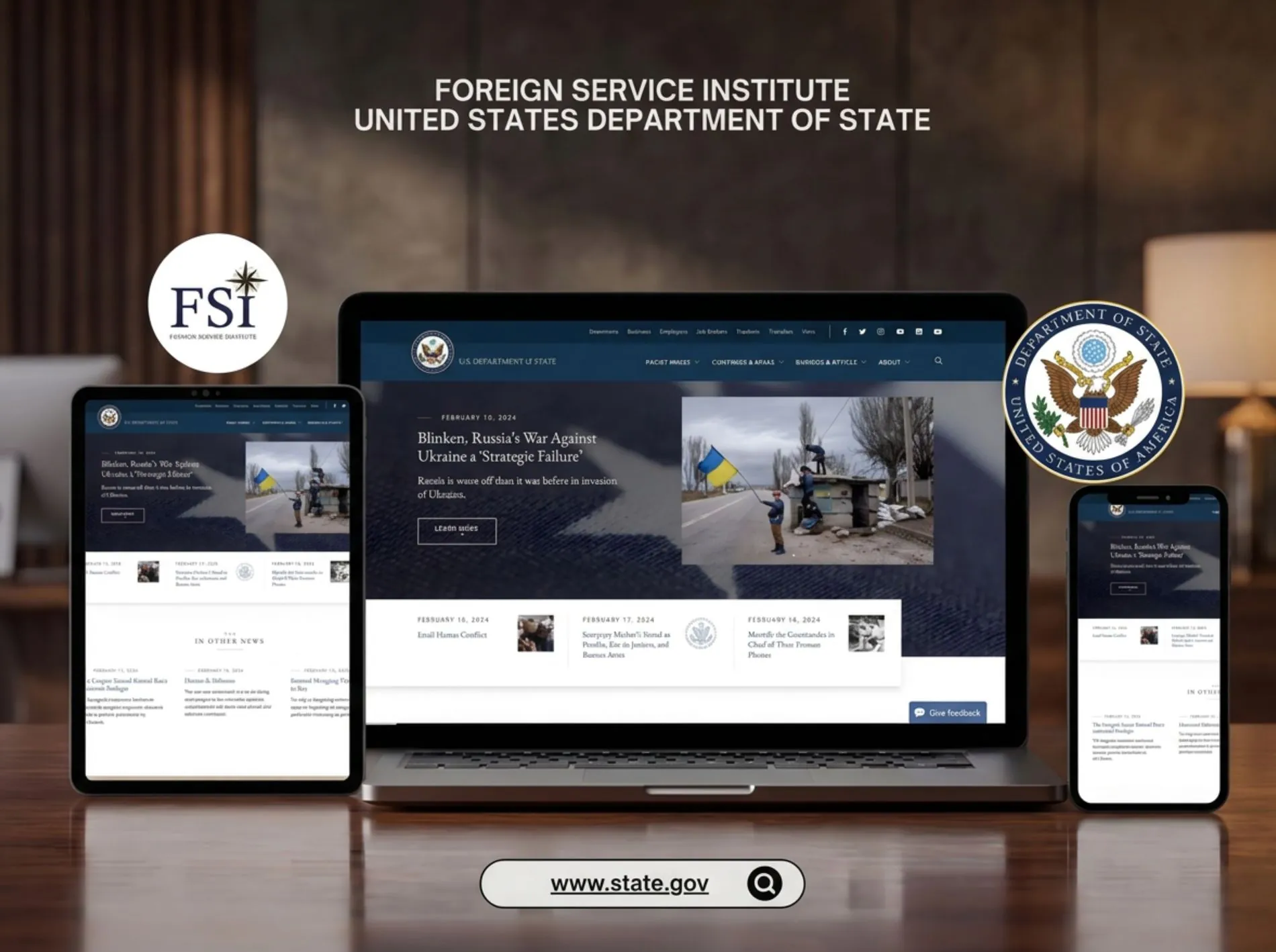
FSI Public Website
U.S. Department of State
U.S. Department of State — diplomatic training programs
Twenty-four separate web applications, built by different teams over different years, used by diplomats in posts around the world — and every one of them had to pass federal accessibility review before it was allowed to ship.
The Foreign Service Institute is where the United States trains its diplomats. Its staff and students moved daily between two dozen separate web applications — course catalogs, registration systems, program portals, reporting tools — each commissioned at a different time, by a different contractor, with its own navigation, its own layout logic, and its own idea of where the important thing lived.
The cost wasn't cosmetic. Someone at a post abroad, on whatever device and connection they had, was relearning the interface every time they switched tools. And because this is federal, none of it could ship without passing Section 508 review — a hard gate, not a recommendation. A design that failed the audit didn't get revised later. It didn't launch.
The obvious approach was to redesign twenty-four applications. The right approach was to design one interface language and apply it twenty-four times.
I argued for a shared pattern library first — navigation, forms, tables, states, typography, color — so that consistency was structural rather than something to police application by application. That reframing is what made the scope survivable on a federal timeline, and it meant a diplomat who learned one FSI tool had effectively learned all of them.
I started by inventorying all twenty-four applications: what each one did, who used it, where the patterns already overlapped, and where they contradicted each other. That audit produced the component set — and, just as usefully, a list of things that could simply be deleted.
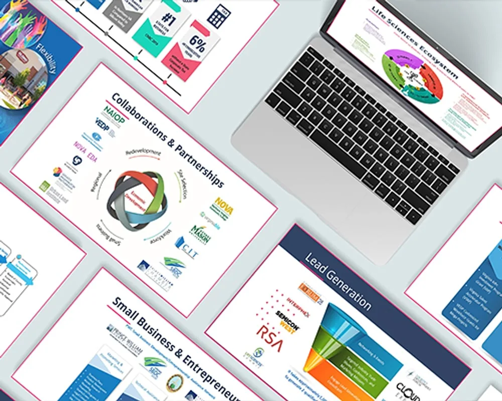
From there: pattern library, then wireframes, then interface design, then accessibility validation against Section 508 and WCAG AA, then staged rollout. Proposal and capture graphics ran alongside on federal acquisition deadlines that did not move.
Contrast ratios, focus order, form labeling, and heading structure were settled while the layout was still gray boxes.
Because retrofitting 508 compliance costs more than designing to itThe same structure, in the same place, with the same labels — whichever of the twenty-four tools you happened to open.
Because switching cost was the actual complaintDense federal content restructured so the task a user came to do is the first thing on the page, not the fourth.
Because nobody reads a training portal for pleasureLayouts that hold up on whatever screen is available at a post abroad, including narrow ones on poor connections.
Because you cannot dictate the device to a diplomat overseasThe redesign shipped across all twenty-four applications with full Section 508 conformance and a 20% lift in engagement. Every web and document deliverable met WCAG standards.
More durably: FSI came away with a component system its future contractors could build against, instead of a twenty-fifth interface.
Accessibility is usually sold as a legal obligation. Twenty-four applications proved the opposite case — that designing for the person with the screen reader forces the clarity that helps everyone else too. The constraint made the work better, not smaller.
The first conversation is free and takes twenty minutes. If it isn't a fit, I'll tell you.