Web UI/UX
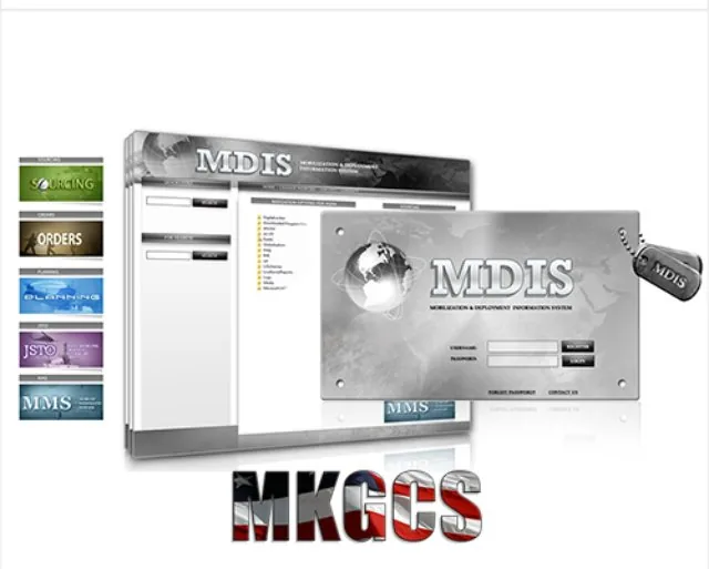
MDIS Interface
Mobilization system
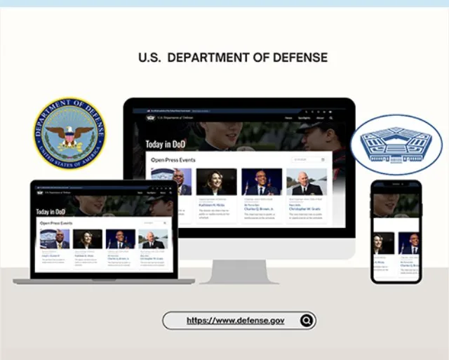
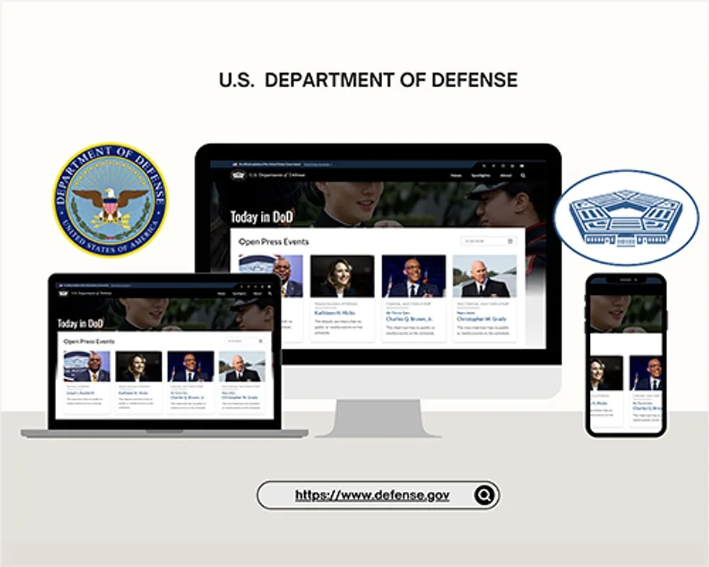
U.S. Department of Defense — Pentagon & Fort Belvoir
Fourteen years designing inside the Pentagon, Fort Belvoir and the Mark Center, where the first person to review your work is a security officer and the second one has about eight seconds to read it.
Across four contracts and fourteen years — the U.S. Army at the Hoffman Building, senior DoD leadership at the Pentagon, the visual overhaul at Fort Belvoir, and Washington Headquarters Services at the Mark Center — the work shared one condition civilian design almost never has: every deliverable cleared a security review before it reached a design review.
The audience compounded it. Briefing material for senior military leadership gets read in the minutes between meetings. A layout that requires patience is a layout that failed, regardless of how it looks.
The governing decision across all of it was to design for the reading conditions rather than the portfolio: high information density that still resolves at a glance, an unmistakable hierarchy of what matters first, and absolutely no ornament competing with content.
Working under a Top Secret clearance also changes the method. You cannot iterate loosely on classified material or take work home to think about it. Decisions get made deliberately, in place, the first time.
Classification review came first — what could be shown, at what level, to whom. Content architecture second: what the briefing actually needed to say and in what order. Interface and layout design third. Build and security sign-off last.
At Fort Belvoir the same sequence ran through a full front-end overhaul: diagrams, site maps, storyboards and functional specifications mapping the user journey before a single screen was designed. At WHS it ran through daily content operations in Drupal and AFPIMS for Pentagon directorates.
Command audiences need a lot on one page. The hierarchy does the work so the density never reads as clutter.
Because scrolling is not an option in a briefingThe Fort Belvoir overhaul used HTML5, CSS3, Bootstrap and Angular Material rather than anything bespoke.
Because the next contractor has to maintain itDrupal and AFPIMS workflows set up so cleared staff could publish without a designer in the loop.
Because a bottleneck with a clearance is still a bottleneckDiagrams, site maps, storyboards and functional specs produced first, reviewed by stakeholders, then designed.
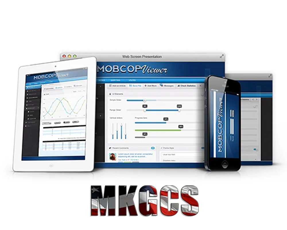
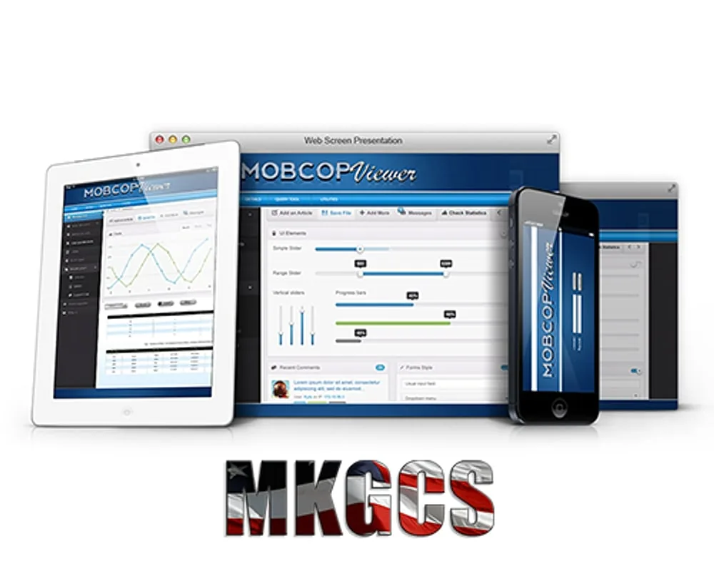
Because rework inside a secure facility is expensiveAcross the engagements: 50+ government web projects and 15+ secure web applications for senior DoD leadership, a full brand and responsive web system for the MKGCS contractor platform, and a front-end overhaul at Fort Belvoir that drove substantial growth in user engagement.
At the Mark Center I also helped organize the Pentagon's 40th anniversary commemoration, including the photography and videography.
Most designers never work somewhere the deadline genuinely cannot move and the reviewer genuinely can stop the project. Fourteen years of that builds a specific habit: decide properly the first time, and make the work survive scrutiny from people who are not designers.
The first conversation is free and takes twenty minutes. If it isn't a fit, I'll tell you.